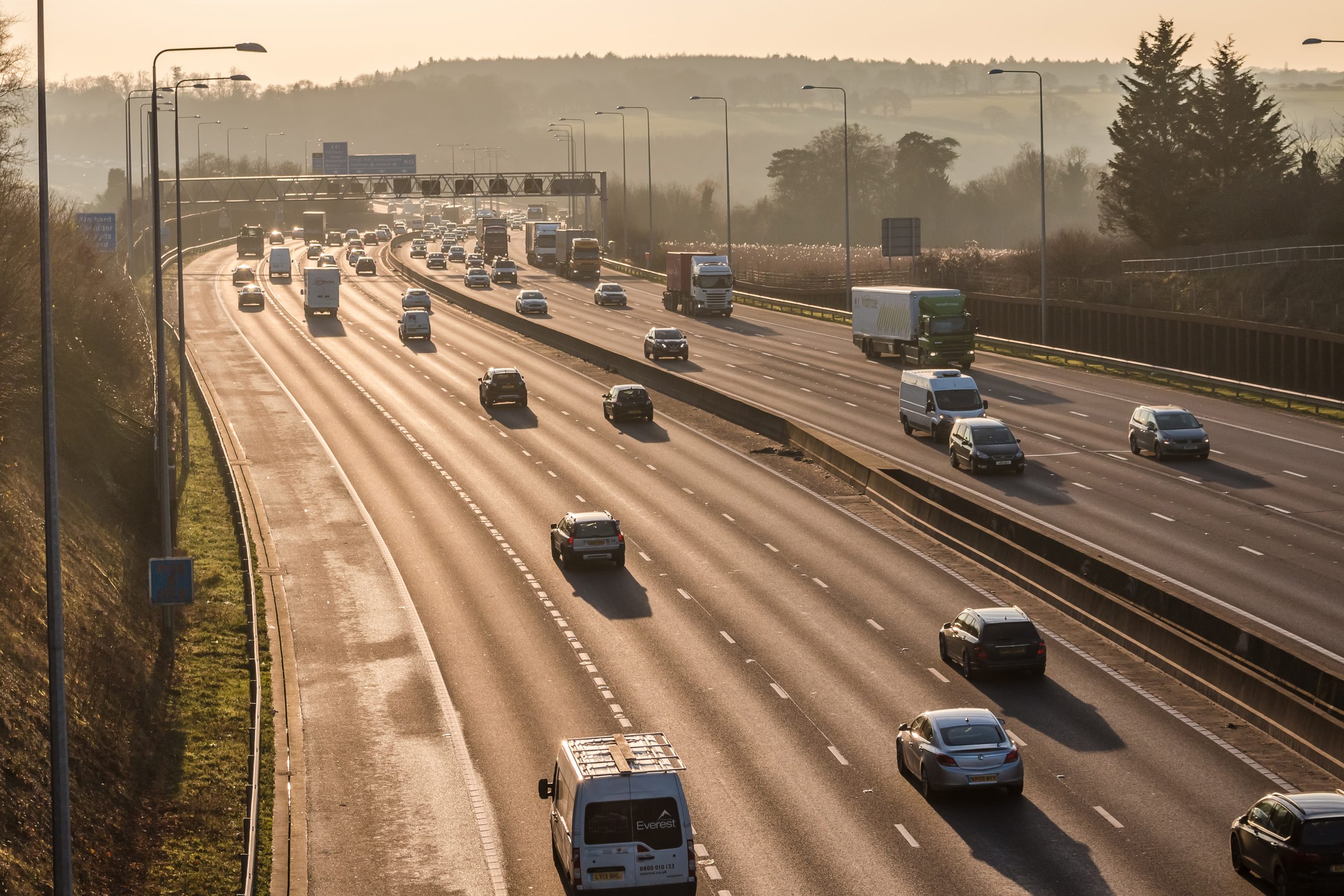
M25 closure this weekend: accurate information is the key for drivers
This weekend sees a full closure of the M25 between junctions 10 and 11 near Wisley in Surrey....
Read more
27 January 2011
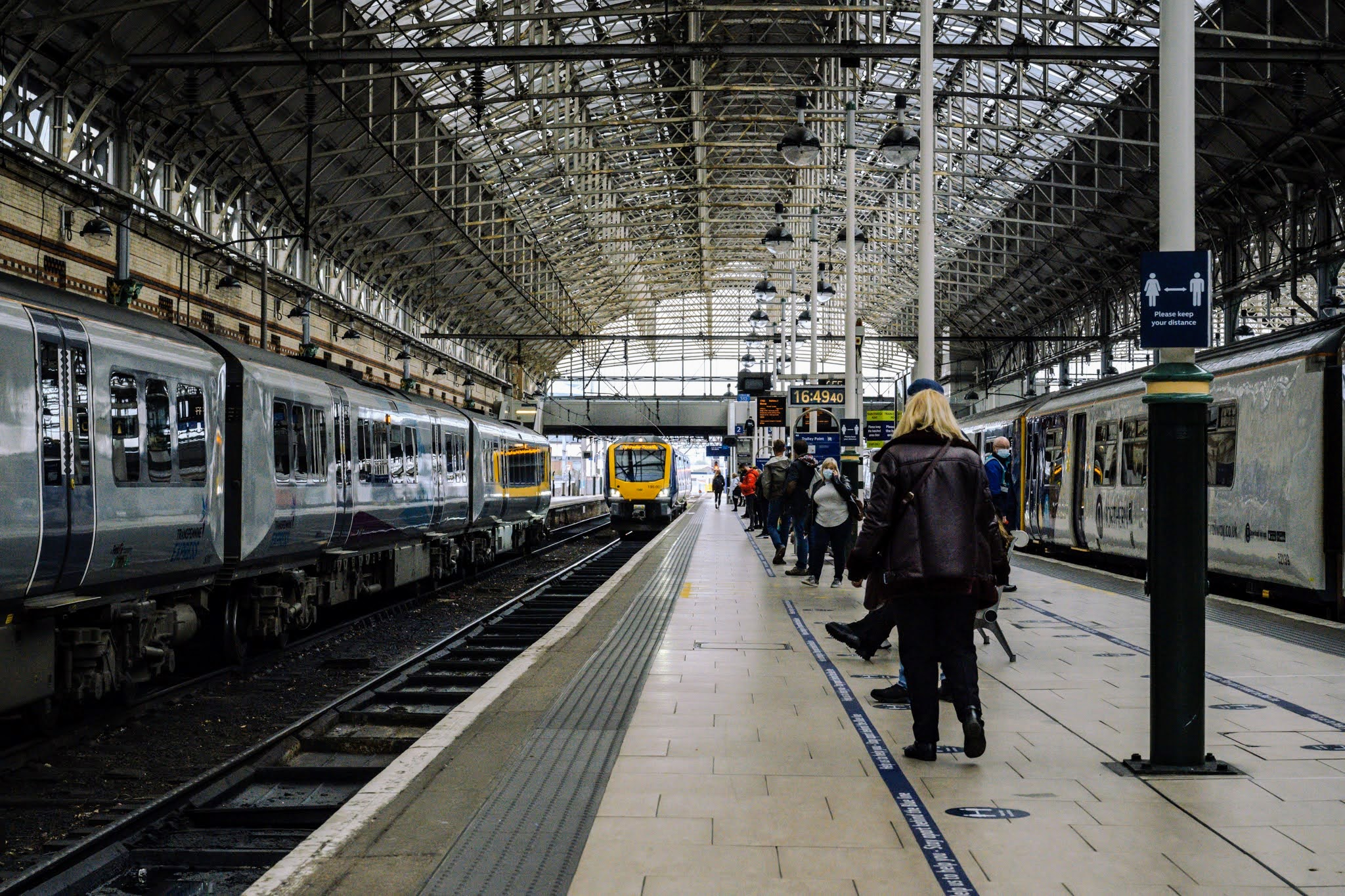
Well you were on it so you know. Most passengers only use one route and one train company, so is your route a good one compared to others? Is your route a poor performer? Yesterday we published the results of our rail National Passenger Survey broken down by train company routes. Passengers, and others, can now get a much better idea of how their services compare to others run by the company as well as others across Great Britain. It would be really good if the train performance data could be published in the same way.
You can see we have broken the results down by journey purpose, age and gender. We have also included a feature on what passengers do while on the train – reading and window gazing feature large!
Satisfaction overall, remains steady and relatively high. 84% of passengers are satisfied with their journey. However, underlying these figures are wide variations. On the best routes nearly every passenger is satisfied. On lower scoring routes 72% of passengers are satisfied. We will use all this data to make a difference for passengers by working on the routes and factors where performance is weaker. Value for money scores are up again, probably as an on-going consequence of the January 2010 fares freeze. It will be interesting to see what happens to these scores when the January 2011 rises affect the next wave of the survey this spring.